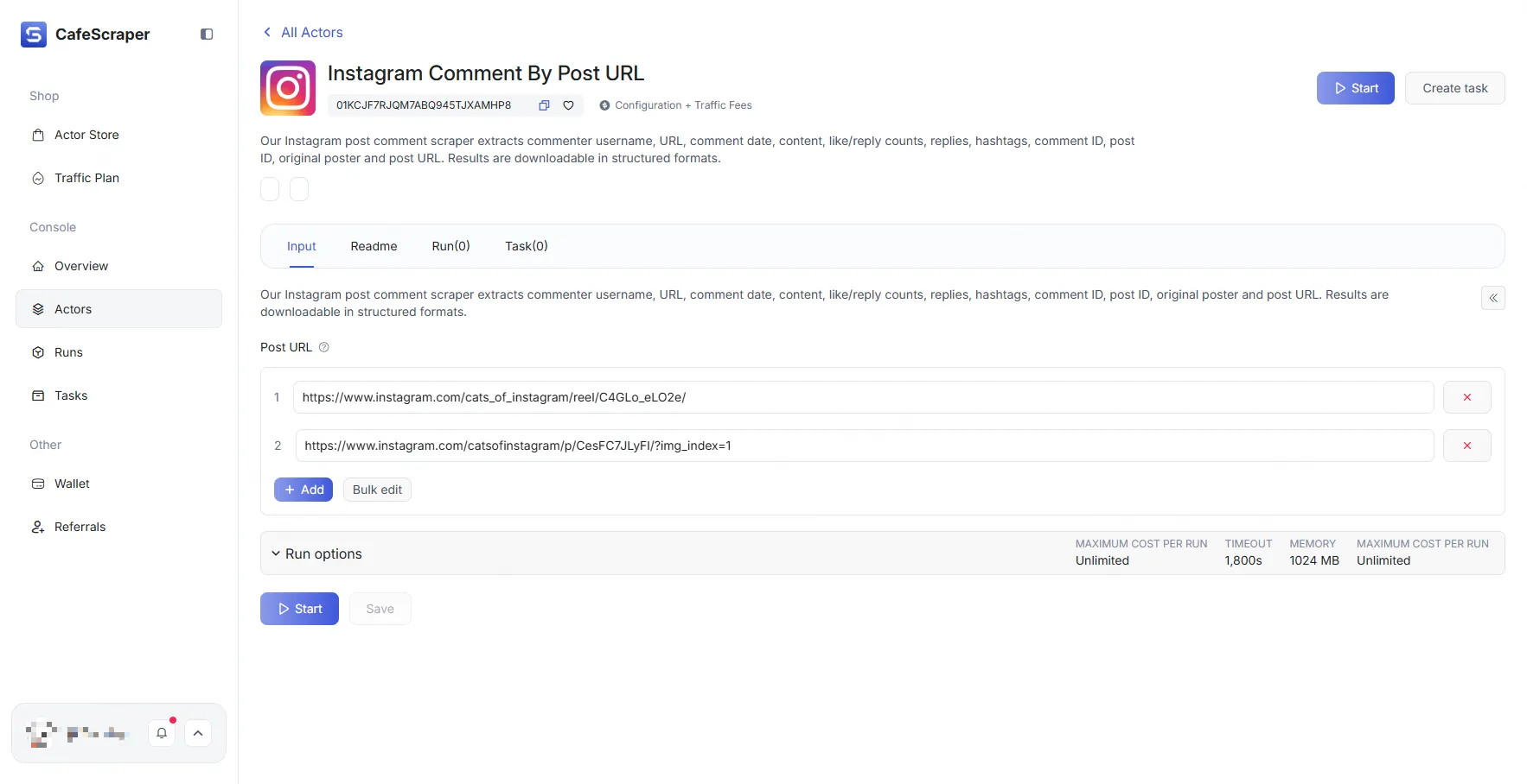
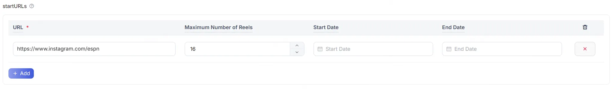
{
"title": "startURLs",
"name": "url",
"type": "array",
"editor": "requestListSource",
"default": [
{
"url": "https://www.instagram.com/espn",
"end_date": "",
"start_date": "",
"num_of_posts": "10",
"posts_to_not_include": ""
}
],
"param_list": [
{
"param": "url",
"title": "URL",
"editor": "input",
"type": "string",
"required": true,
"description": "This parameter is used to specify the Instagram access URL to be fetched."
},
{
"param": "num_of_posts",
"title": "Maximum Number of Reels",
"type": "integer",
"editor": "number",
"description": "This parameter is used to specify the maximum number of Reels to fetch."
},
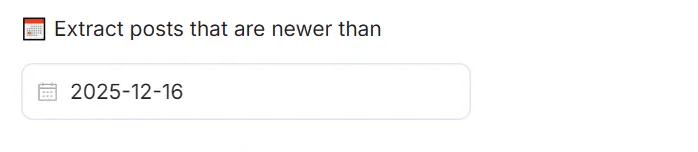
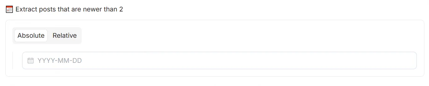
{
"param": "start_date",
"title": "Start Date",
"type": "string",
"editor": "datepicker",
"format": "MM-DD-YYYY",
"valueFormat": "MM-DD-YYYY",
"description": "This parameter is used to specify the start time of the post, format: mm-dd-yyyy, and should be earlier than the \"end_date\"."
},
{
"param": "end_date",
"title": "End Date",
"type": "string",
"editor": "datepicker",
"format": "MM-DD-YYYY",
"valueFormat": "MM-DD-YYYY",
"description": "This parameter is used to specify the end time of the post, format: mm-dd-yyyy, and should be later than the \"start_date\"."
}
],
"description": "The URLs of the website to scrape"
}